As a Shopify user, your product pages are incredibly important. They are your opportunity to showcase your products and lead your prospective, or returning, customers to a sale. As such, it is vital to optimise these as best as possible in an increasingly competitive eCommerce landscape.
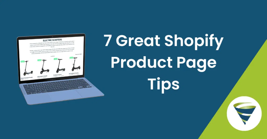
In this blog, we’ll be diving into 8 of our best Shopify product page tips to create amazing, high-converting product pages!
Grab a coffee and let’s get stuck in ☕
1. Use clear images to showcase your products
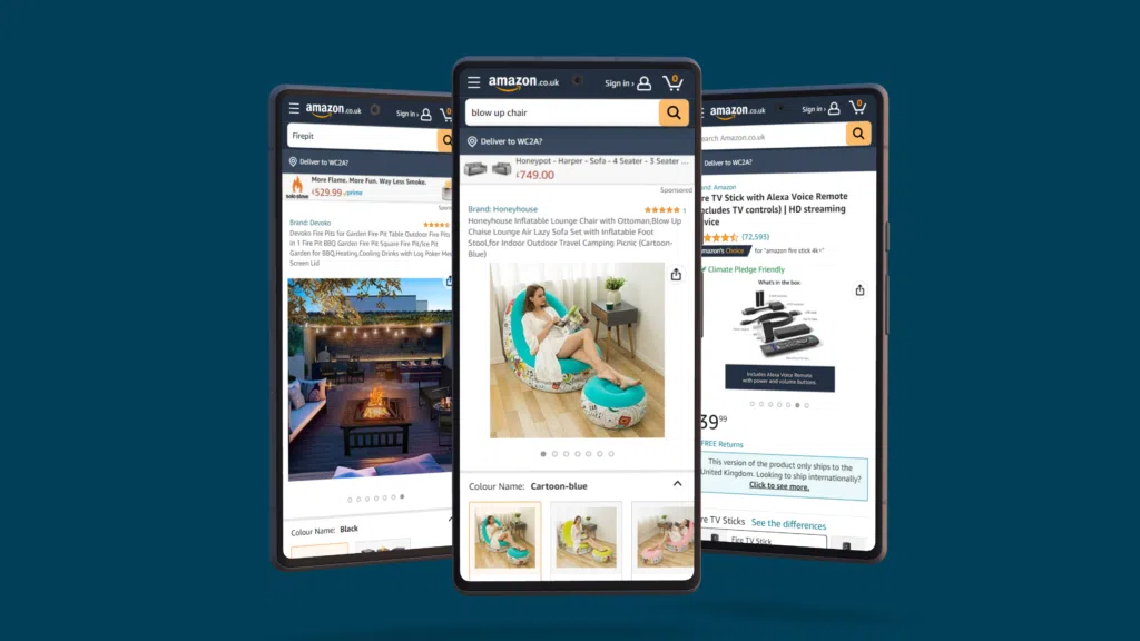
In the current digital age, your customers will be hopping around a lot of different sites before they make a decision on what they really want. As such, it’s absolutely crucial that you captivate your audience and position your products as the desirable solution.
Part of doing this is ensuring that you have high-quality and clear images of your products. This does a number of things:
- It reassures your customer that they have found the right item.
- It communicates the quality of the product in a way that text on a page cannot
- By extension, it communicates the quality and authenticity of your brand
For items of a high value, this is incredibly important as it allows you to provide as much information to your potential buyers as possible. Consider including:
- Multiple angles of your product or an interactive 360 experience. This is also great for mobile!
- Close-ups to show off the quality of your product and the details that your customer might be looking for
- The product in use. Remember, you’re also selling a lifestyle! Help your customers envision your product in their lives
2. Display your prices clearly and effectively
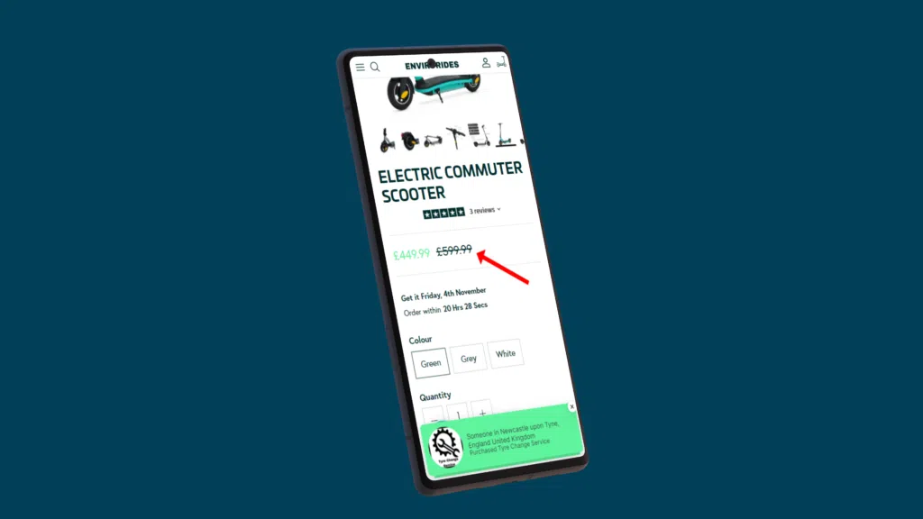
Regardless of all listings, this is undoubtedly the most influential component when it comes to a customer’s decision to purchase a product or not. Nevertheless, you might not have much control over pricing your business’ products. So, what can you do?
Size and placement
The sizing and positioning of the price are important to consider. A price that is physically displayed too small could be lost among other less important information. Too big and it could scare people off.
Discounts
People love a bargain. If you have a product sale on your website, communicate it SUPER clearly. Consider displaying the reduced price next to the original price on a listing. It can also be a great tactic to include the reduction percentage next to the price as well. Being able to shout about a product that is 30% reduced is very powerful. Albeit, a 5% decrease doesn’t sound too compelling, so it may be worth being selective on what you use this on.
3. Include compelling “call-to-action” buttons (CTAs)
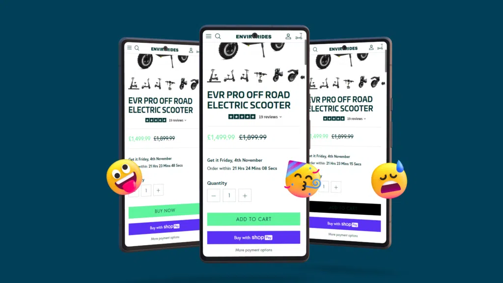
CTA buttons are a fundamental part of leading your audience to take the desired action on your website. They are important to get right as they guide your user’s journey from when they first land on your website up until the point they convert, so it cannot be understated how critical it is to get these right.
Page placement
It’s important to place your CTA buttons where your users will expect them to be. There isn’t a ‘one size fits all’ solution to this and it will vary depending on the products or services being sold. It’s a great idea to A/B test these and permanently implement the placement that yields the best results.
Colours
CTAs need to be visually impactful and they need to stand out. Use bold, contrasting brand colours for every CTA to guide your user journey. Remember, it’s about creating an experience that is intuitive for your users. It needs to be clear to the user that clicking your assigned CTA button, will take them to the next point in their purchasing experience.
Text
The text for your CTAs needs to be concise and clear. Do you want to create a box for users to click on that adds a specific product to their basket? Have your text read something simple like “Add to basket”. Don’t overcomplicate it and don’t fall into the trap of thinking you need to reinvent the wheel.
Effective CTAs adhere to what users expect to see based on decades of eCommerce website usage.
4. Include product reviews
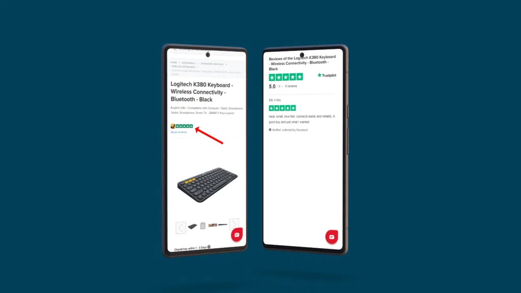
Trust is the key to building any successful brand. Your audience wants to know that you are the trustworthy solution. Remember, when your prospective customers are considering buying from you, they are asking themselves: is the product any good? How do I know if it will arrive in time? Can I trust this company?
To find these answers, people will turn to unbiased opinions from those who have bought from you. So, make it easy for them — Include these on your product page. This will reaffirm to customers that they are indeed making the right choice by buying from you and that it isn’t a gamble.
5. Use videos on your product pages

While images are important on any product listing, it’s becoming best practice to also make to implement videos into your product pages. Users want to know how your product works or is used in the wild. Short and engaging videos are quickly becoming a staple in any eCommerce store!
It also gives you an opportunity to get creative and reinforce your brand.
6. Use clear and engaging product descriptions

Product descriptions are another opportunity to showcase what makes your products unique to your prospective customers. Put yourself in the shoes of the customers. What is it you would want to know? Why is this product special? How can it improve my life?
Keep your description short, sweet and compelling. Answer those critical questions above!
7. Build your product pages for mobile
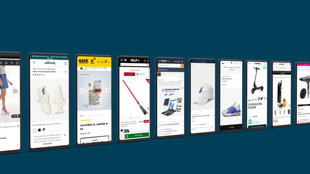
Mobile device usage is growing exponentially and many of the leading eCommerce brands are prioritising the mobile user experience. There is a high likelihood that the majority of your website traffic comes from users on mobile devices. As such, it is paramount that you optimise your site for this view.
When adding ANYTHING to your website, consider how it looks and functions on mobile, too. Test, test, and test again. Do your critical CTA buttons function on mobile? How are your page speeds and Core Web Vitals?
This is also highly important from an SEO perspective as well. Mobile pages are crawled and indexed by search engines before the desktop versions so this is something that is crucial to consider from a technical SEO standpoint. Remember, a website well-optimised for CRO is only valuable if it can be discovered in search results.
Technical SEO for eCommerce sites can be a bit of a headache and it’s something that requires constant attention and action. If you can’t dedicate the resources yourself, consider getting help from an expert Shopify SEO agency or eCommerce SEO agency to create and maintain high-performing Shopify product pages!


One Response
From an SEO standpoint, this is also very significant. Mobile pages are crawled and indexed by search engines before desktop versions, so from a technical SEO perspective, this is something that is crucial to take into account. Keep in mind that a website with effective CRO is only worthwhile if users can find it in search results.