This post is part of The Ultimate Guide to eCommerce CRO created by our eCommerce CRO Agency team.
Also in this series:CRO stands for Conversion Rate Optimisation. It’s a process of improving the percentage of website visitors who take a desired action, such as making a purchase, signing up for a newsletter, or filling out a contact form. Regardless of your eCommerce site’s platform (Shopify, WooCommerce or Magento,) as the owner of an eCommerce store, your product pages serve as the gateway to attracting and retaining customers, making it imperative to implement effective conversion rate optimisation strategies, so that you have high-converting product pages.
In this article, we’ll explore eight actionable tips to enhance your product pages’ conversion rates and drive sales.
1. Use Compelling Call-to-Action Buttons (CTAs)
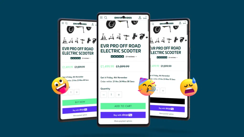
Your call-to-action buttons serve as signposts guiding visitors towards the desired action. A well-built CTA can increase conversions by 121%, so let’s look a little further into some of the ways you should consider CRO when it comes to call-to-action buttons.
Ensure your CTAs stand out with bold, contrasting colours that draw attention. We have personally seen some of our client’s conversion rates improve massively after simple changes to the colour of a CTA.
Use clear and concise text that communicates the action you want users to take, whether it’s “Add to Cart” or “Buy Now.” Experiment with placement to find the optimal position for maximum visibility and effectiveness.
Make sure that your CTA’s work effectively on devices (mobile, tablet & desktop.) Just because the CTA works on the desktop version, does not mean it will work on mobile. One of the biggest issues we come across is that tap targets (buttons) aren’t large enough on mobile devices, which ultimately creates frustration for the user resulting in fewer conversions.
2. Show Off Your Products with Clear images
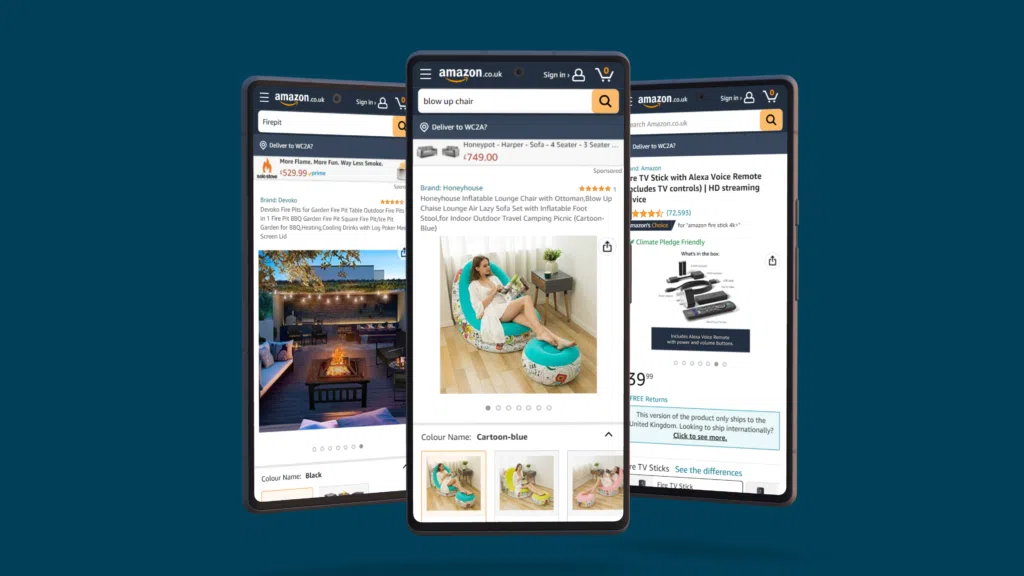
High-quality product images are essential for building trust and providing customers with a clear understanding of what they’re purchasing.
Utilise multiple angles and close-ups, as this can allow for:
Enhanced User Understanding: Multiple angles provide a comprehensive view of the product, while close-ups highlight details, improving customer understanding.
Boosted Confidence: High-quality images build trust and confidence in potential buyers, reassuring them about the product’s quality and authenticity.
Increased Engagement: Varied imagery captures attention and encourages users to explore further, leading to higher engagement and interaction.
Competitive Edge: Employing multiple angles and close-ups distinguishes your product pages, showcasing transparency and reliability, giving your brand a competitive advantage.
Also considering lifestyle/practical product shots to showcase your products effectively, it is easier for a customer to make a purchase, if they can picture themselves using it.
And always make sure to invest in professional photography to create visually appealing images that captivate your audience, where you can.
3. Effective Product Price Display
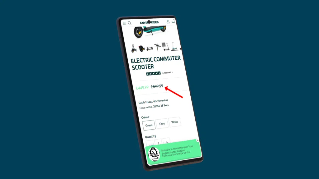
Displaying the product price prominently can improve conversion rate optimization (CRO) by increasing transparency, reducing friction in the purchasing process, and managing customer expectations upfront, leading to more informed and confident buying decisions.
Experiment with size, colour, and placement to find the optimal configuration. Highlight discounts and savings to incentivise purchases and make sure the pricing information is clear and easy to find.
4. Concise and Informative Product Descriptions
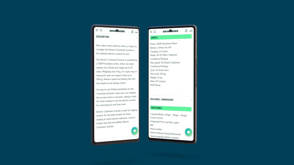
Craft product descriptions that are clear, concise, and tailored to your target audience. Focus on highlighting key features and benefits while avoiding overwhelming the reader with unnecessary details. Use bullet points to make information easily understandable and ensure important details are not overlooked.
5. Highlight Your Product’s Key benefits
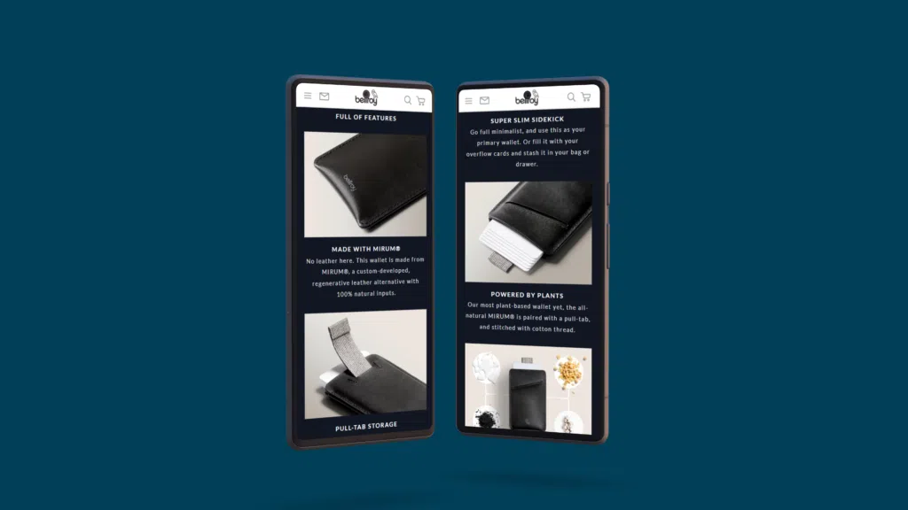
In a sea of options, it’s crucial to communicate the unique benefits of your products. Create a compelling list of key benefits that address your customers’ pain points and differentiate your offerings from competitors. Keep it concise and impactful to capture the reader’s attention and drive home the value proposition.
6. Use Video to Increase Engagement

Simalary to the reference we made earlier for CTAs, Video content can improve conversion rates by 86%. So as we can see video content is a powerful tool for engaging customers, providing them with a richer understanding of your products and in turn helping you build high-converting product pages.
Incorporate videos into your product pages to demonstrate usage, showcase features, and connect with your audience on a deeper level. Short, engaging videos can significantly enhance the user experience and increase conversion rates.
7. Reviews Help to Build High-Converting Product Pages.
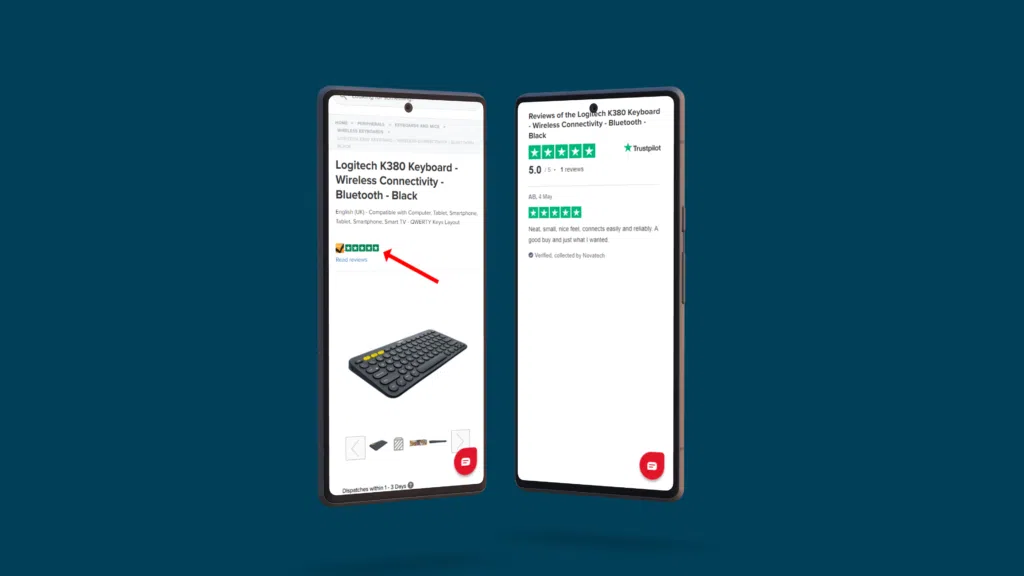
Trust is the key element to any website. Building trust with your target audience could be the difference between your eCommerce store converting or not. A proven method to build trust on any eCommerce website is to build and display product reviews and customer testimonials.
It’s proven that people tend to do what others have already done. Showing reviews of your products by real people can help build confidence in new customers to make that all-important purchase decision.
Reviews can have more influencing power than any of your images, prices, or product descriptions. Some users rely on reviews to make their final decisions. Users tend to look for two main factors when looking at reviews; the average rating score and the number of ratings on average they’re based on. If possible, make sure you are displaying both.
8. Always Build Your Product Pages for Mobile Devices
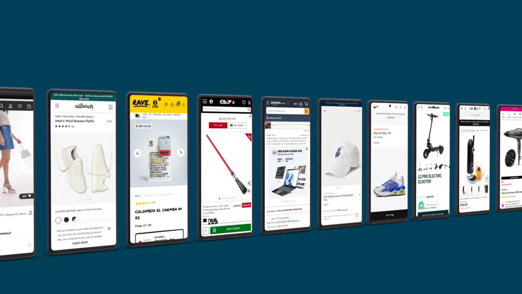
Mobile devices are now the go-to when searching the internet. It’s now more likely that your eCommerce store will be viewed on a mobile device rather than on a desktop. While you should design and optimise your product pages for both mobile and desktop, mobile should always be your top priority.
When creating a product page for mobile first, ask yourself, Are the product listings, images, and product descriptions clear on smaller screens? Are the CTAs easy to find and large enough to tap on? Always keep in mind how a user would use your store on a device.
What’s more, Google now favours websites that are optimised for mobile so make sure your product pages are as high-converting product pages as they can. Your main aim is to give your customers an amazing user experience. Doing so will make it more likely for them to stay, buy and come back to your store!
9. A/B Testing: Boost Your Conversion Rates
A/B testing is a powerful method in Conversion Rate Optimization (CRO) where you compare two versions of a webpage to see which performs better. By experimenting with elements like CTA colours, text, and product images, you can gain insights into user preferences and optimize your pages for higher conversions.
To discover actionable A/B testing tips for improving your product pages, article on A/B Tests to Make your Product Pages Convert Better.

