Your checkout page is the final step to turning website visitors into customers on your website. From expensive shipping to bad website navigation, there are many reasons why a customer could abandon their purchase journey. Cart abandonments are all too common on any eCommerce website and working out why they were abandoned in the first place is a key step to improving your checkout page to ensure that future customers stay and buy!
In this article, we’ll cover actionable tips for Checkout Page CRO, which ultimately will improve your eCommerce site’s conversion rate when it comes to your checkout page.
Use Autofill Forms to Ease Your Customer’s Purchase Journey
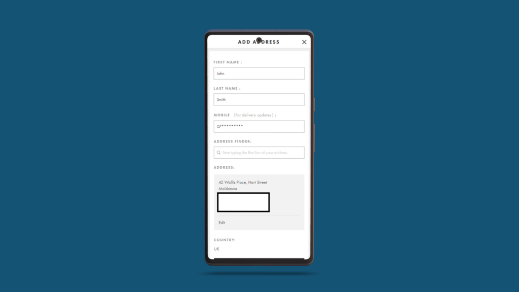
Forms are a necessity on all checkout pages. They’re a surefire way to get the important information you need from the customer. But long, tedious, field-heavy forms tend to put even the most enthusiastic buyer off.
You should always attempt to make this process as easy as possible for the user, and that’s where smart forms with autofill capabilities come in. As the name suggests, these forms will auto-populate the form fields with the user’s information. Tools such as Google Autofill can take information (safely) the user has in their Google account.
Names, addresses, phone numbers, and even card numbers can be automatically entered in the blink of an eye doing the job for the customer and making their purchase journey a breeze.
Give the Customer Control
When it comes to checkout page CRO making the customer feel like they are in control of their purchase journey is critical to having them stay throughout. There are several ways you can create this ‘illusion’ below are two.
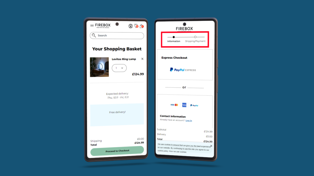
Progress Indicators
Showing the customer a progress indicator is a great way to keep them in the know to what they have to do to complete a purchase. These are usually shown at the top of a checkout page and indicate the stages a user will need to take as well as how long each stage could take.
Giving the user this information from the beginning can help your customer subconsciously plan their next move, making the whole process easier for them.
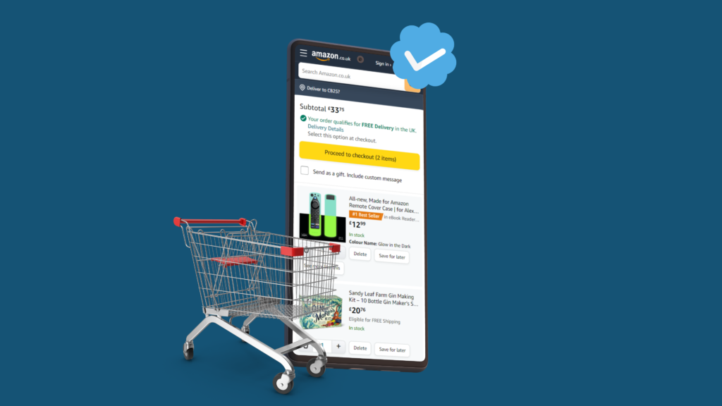
Let People Review Their Shopping Cart
Before sending your customer to that all-important checkout page, it’s important to ensure that the customer is happy with everything they used your eCommerce store for. Always show a clear way for them to view and review their shopping cart.
This builds trust with the customer and is more likely to proceed further knowing they are always in control and getting what they came for.
Always Use Clear & Precise CTAs

As with any page on any website, it’s best practice to use clear and precise ways to help the customer navigate through your web pages. Checkout pages are no different and are in some ways the most important place to use clear and precise call-to-action (CTA) buttons.
These need to be found when the customer is looking for them. Always use contrasting brand colours for the most important CTAs, coupled with expected button copy (secure checkout, continue to payment), these CTAs will have a better chance of increasing conversion rates.
Additionally, CTAs are another element on the page that can help build trust with your customers. Test the use of icons on buttons. These have proven to help increase CTRs and conversions. For example, in a recent test we performed for an online eCommerce store, a button with a padlock icon indicating ‘security’ proved to improve the checkout process and converted better than and button without the icon!
Keep Your Prices Clear and Transparent
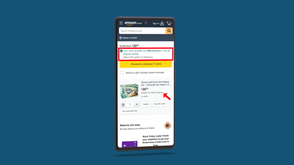
One of the main reasons users abandoned carts is because of unexpected costs such as expensive shipping or hidden VAT costs added at the last minute.
While you may not be able to offer free shipping it’s best to show the customer exactly what it is they will be spending to give them a clear picture throughout their purchase journey.
Look at explaining potential benefits for additional prices. If your shipping fees appear ‘high’, be clear as to why and help benefit the customer by explaining that their order will be with them in a smaller allotted time, making the added cost worth it. There are multiple ways to help benefit the customer in the checkout process but it’s best practice to always be transparent when displaying your prices.
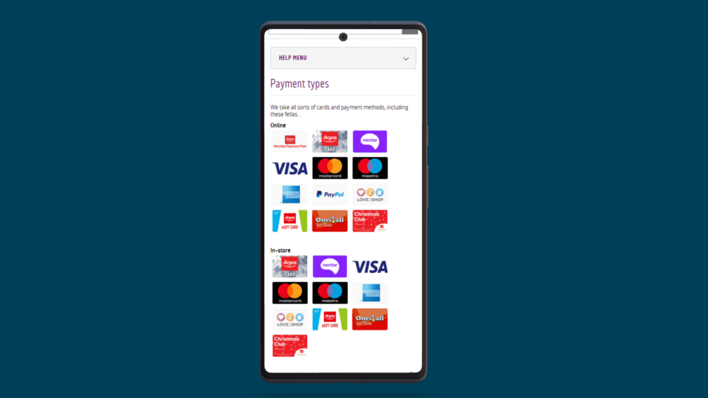
Show Badges on Your Checkout Pages to Build Trust
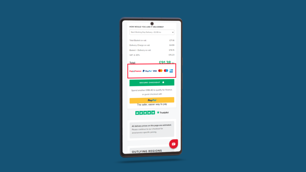
Security badges, trust seals, and payment logos are now a staple on all checkout pages. Without them, is the page even credible? Using these badges helps to reinforce the security of your eCommerce store. They are relatable and help to make the customer feel safe and secure when making a payment in your store, which is of paramount importance.
Using badges with padlocks, verified check marks, and regularly used card providers will show your customers that they can trust your business and are more likely to continue with their purchase.
A/B Testing to Improve Checkout Pages Conversions:
A/B testing is a simple and effective way to improve your checkout pages and increase conversion rates. By comparing two versions of a page (the A version and the B version), you can determine which one performs better and make data-driven changes to your website. It is in your best interest to improve your eCommerce UX and CRO.
Here are some of the different ways you can use A/B Testing for Checkout Page CRO:
1. Test different calls-to-action (CTAs)
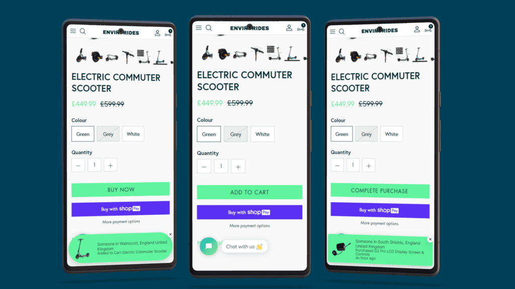
The call-to-action (CTA) is the most important element on your checkout page. It’s the button that encourages visitors to complete their purchase, so it must be clear, compelling, and easy to find.
To test the effectiveness of your CTA, try creating two versions of your checkout page. In the A version, use a CTA such as “Checkout” or “Buy now.” In the B version, try a different CTA such as “Complete purchase” or “Add to cart.”
By comparing the conversion rates of the two pages, you can determine which CTA is more effective and use that on your checkout page.
2. Test different forms of payment
Not all customers prefer the same form of payment, so it’s important to offer a variety of options on your checkout pages. To determine which forms of payment are most popular with your customers, try creating two versions of your checkout page. The A version offers only the most popular forms of payment, such as credit cards and PayPal. The B version offers additional forms of payment such as Amazon Pay or Google Pay.
By comparing the conversion rates of the two pages, you can determine which forms of payment are most popular with your customers and ensure that they are prominently featured on your checkout page.
3. Test different page layouts
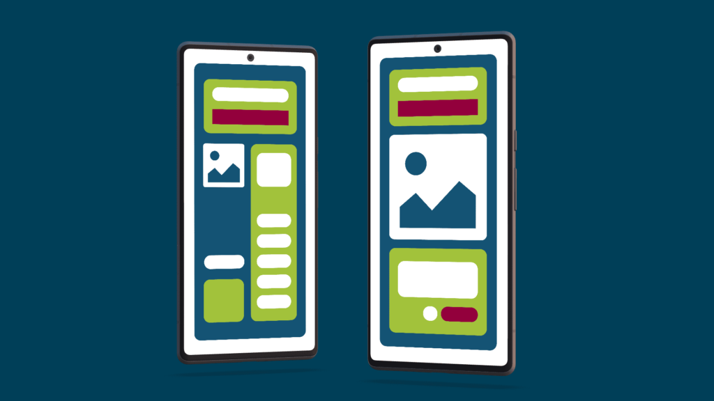
The layout of your checkout page can have a significant impact on its effectiveness. To determine the best layout for your page, try creating two versions of your checkout page. In the A version, use a traditional layout with the payment form on the left and the order summary on the right. In the B version, try a different layout such as placing the payment form at the top and the order summary below it. Keep in mind that it is important for both versions to work well on all devices.
By comparing the conversion rates of the two pages, you can determine which layout is more effective and use that on your checkout page.
4. Test different images
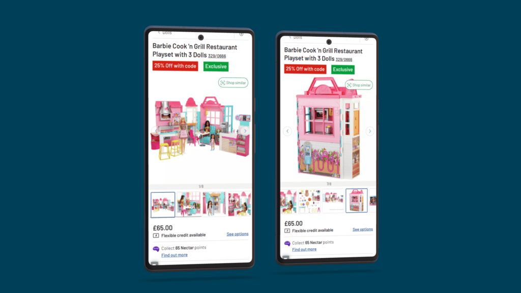
The on-page-load images you use on your checkout page can also impact its effectiveness. To test the impact of different images, try creating two versions of your checkout page. In the A version, use product images to show customers what they are purchasing. In the B version, try using lifestyle images that show customers how your product can be used in their daily lives as people tend to like to imagine using something before they purchase. How can your product benefit them?
By comparing the conversion rates of the two pages, you can determine which type of image is more effective and use that on your checkout page.
5. Test different trust signals
Building trust with your customer is extremely important for them to complete their purchase. To test the effectiveness of different trust signals, try creating two versions of your checkout page. In the A version, use trust signals such as customer reviews, star ratings, and money-back guarantees. In the B version, try using additional trust signals such as security badges and SSL certificates.
By comparing the conversion rates of the two pages, you can determine which trust signals are most effective and use them on your checkout page.
Always Build Your Checkout Pages for Mobile Devices
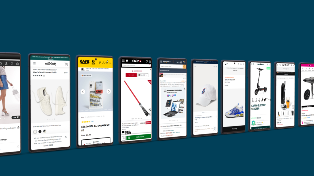
Mobile makes up to 50%-60% of business-to-consumer searches, meaning mobile devices are now the go-to when searching the internet. It’s now more likely that your eCommerce store will be viewed on a mobile device rather than on a desktop. While you should design and optimise your checkout pages for both mobile and desktop, mobile should always be your top priority.
When creating a checkout page for mobile first, ask yourself, Are the product listings, images, and product descriptions clear on smaller screens? Are the CTAs easy to find and large enough to tap on? Always keep in mind how a user would use your store on a device.
What’s more, Google now favours websites that are optimised for mobile so make sure your checkout pages look the best they can. Your main aim is to give your customers an amazing user experience. Doing so will make it more likely for them to stay, buy and come back to your store for more!
Optimising your checkout pages CRO is crucial for improving your website’s conversion rate and enhancing the overall user experience. By implementing effective Conversion Rate Optimisation (CRO) tips, you can streamline the checkout process, reduce friction, and ultimately increase the likelihood of visitors completing their purchases.
Remember to prioritise a clean and intuitive design, minimize form fields, offer multiple payment options, and leverage trust-building elements such as security seals. Regularly test and analyse your checkout pages to identify potential bottlenecks and areas for improvement. With a strategic approach to your checkout page CRO, you can transform your checkout pages into a seamless and user-friendly journey, contributing to higher conversion rates and increased customer satisfaction.