Your category pages are a window for your website visitors to view what it is you sell and ultimately find what they want.
From out-of-stock products to confusing page navigation, there are many reasons why a customer could abandon their search. Giving the customer control of the way they search for a product is paramount to the success of your category pages and your eCommerce store in general. Improving your category pages is a surefire way to ensure that future customers stay and buy!
In this article, we’ll Category Page CRO Tips you can make today, that will give your category pages more of a chance at converting.
Let Customers Compare Your Products
Your product pages should be effortless for the user. Customers are always looking for the best product for them and your goal is to provide that in the most informative and simple way possible.
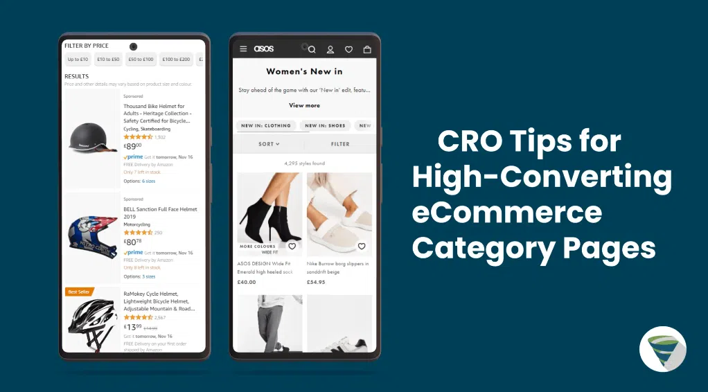
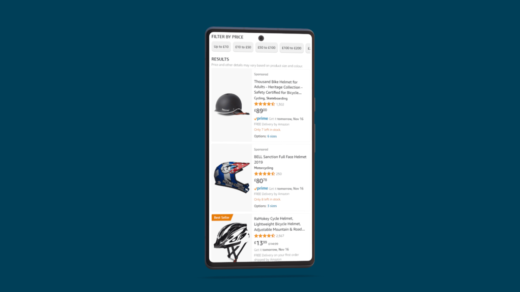
To do this, make sure each product listing clearly shows product images, names, prices, star ratings, and more so potential customers can understand each product at a glance. Doing so will help shoppers compare each listing with ease, giving them more control over their choices and purchases.
A typically well-optimised product listing should include:
- Clear, concise product images
- Clear Product names
- Descriptive Product specification
- Clear price
- Customer rating and the number of raters
- Customers reviews
- Stock availability
- Clear Shipping options
If each of your listings uses these on your category pages, then they are more likely to give the customer more options to compare and more reasons to convert.
Improving Navigation and Filtering on Category Pages
When it comes to Category Pages CRO tips user-friendly navigation isn’t just a perk; it’s a conversion booster. Imagine a store where aisles make sense – that’s what your online categories should be. Easy navigation means less frustration, fewer bounces, and more conversions. It’s the secret sauce to turning visitors into happy customers. Keep it simple, and watch those sales soar!
Here are some things to think about when it comes to Category Page Navigation:
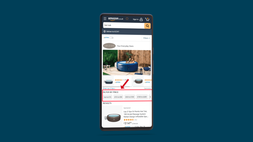
Implement Intuitive Filters
When you’re on a mission to find something online, it’s like a treasure hunt. That’s where intuitive filters come in. These aren’t just buttons; they’re your search sidekick.
Think size, color, brand, price – the basics. These filters aren’t fancy, but they’re the real MVPs. Ever tried looking for a black shirt in a sea of colors? Filters are your shortcut to the jackpot.
Why care? Because when users can slice and dice their search, they hit the bullseye faster. It’s like having a personal shopper who knows your style. Quick, easy, and satisfying – that’s the power of intuitive filters. They turn the hunt into a breeze and make your users feel like search superheroes. Simple buttons, happy customers.
User-Friendly Sorting Options
Shopping shouldn’t feel like a maze. Enter sorting options – the unsung heroes of online browsing.
Ever landed on a website and felt lost in a sea of products? That’s where sorting comes in. Picture this: default sorting as your starting point, like a roadmap. Then, there’s alphabetical order – classic and easy. Then sorting by popularity, relevance, and price – it’s like having a personalised shopping assistant. Find what’s hot, what matches, and what fits your budget, all in a click.
Customisable sorting is the game-changer. Let users shop their way, making your store a breeze to navigate. No fuss, just find and go. That’s the power of sorting options – turning confusion into clarity for every kind of shopper.
Create Sub-category Sections For Easier Website Navigation

Subcategory sections on category pages are a great way to help your customers navigate with ease. Giving them options to find their desired product using minimal effort will improve your eCommerce store’s overall user experience.
Often placed in the top navigation bar, sub-category sections help the user sort through your product categories faster. Even if they were to leave your page, giving them the option to find where they left off with ease on their return is an extremely important quality for your website to have and can improve overall conversion rates.
Alternatively, it can be beneficial to place your sub-category options to the left of a screen (on a desktop) readers tend to read left to right on any webpage, so placing it here will help it be found easier, possibly multiple times.
Promote Popular Categories and Products Using Featured Content Blocks

In time, you’ll start to see what your most popular categories and products are. These are what you should shout about the most! People tend to do what others have done before them. If you showcase your most popular products on your category pages, then intrigued customers could be more likely to click to see why they are so popular.
The layout of any eCommerce category page is very important. Where you place specific products could be the difference between someone purchasing them or not. Showcasing your most popular categories and products through branded content blocks with clear sub-headings can help make them stand out on a page and are more likely for the customer to navigate towards.
A/B Testing Strategies for Category Pages
Category pages in eCommerce pose challenges and opportunities. Enter A/B testing – an absolute game-changer when it comes to Category Page CRO Tips. Your category page is an experience, not just a shelf. A/B testing is the shortcut to optimisation, tweaking layout, content, and functionality. It turns guesswork into strategy, making your category pages unbeatable. Ready for eCommerce excellence? A/B testing is your ticket.
A/B Testing: Page Layouts
Ever wondered why some category pages feel like a smooth ride while others do not? It’s all in the layout. Enter A/B testing – your key to unlocking the layout’s impact on user engagement.
Picture this: Grid view vs. List view. It’s not just a design choice; it’s a game-changer. Grids showcase more, List gives details. A/B testing these variations is like adjusting the spotlight on your products. What catches the eye? What keeps users scrolling?
The layout isn’t just about looks; it’s about product visibility and appeal. A/B testing helps you decode what clicks with your audience. It’s not a guessing game – it’s a strategic move to make your category page a magnet for engagement. Ready to transform your layout game? A/B testing is your secret weapon.
A/B Testing: Product Images & Information
In A/B testing, getting the hang of product images and info is key. Tweak image size and quality until you hit the sweet spot that grabs attention. A/B testing is your guide, helping you figure out what works best for your audience. It’s not just about looks and words; it’s about A/B testing mastery.
When it comes to product details, find the right balance for better decision-making. A/B testing reveals the winning combo, making your category page a conversion powerhouse. It’s not just a process; it’s turning data into design, making every click count.
A/B Testing: Call To Action Buttons
This exploration focuses on A/B testing strategies for optimizing Call-to-Action (CTA) buttons on category pages, emphasizing CTA text, colors, and placements.
CTA Text Variations:
Experiment with different CTA texts like “Shop Now,” “Explore Collection,” or “Discover Deals” to identify the most resonant messaging.
Colour Variations:
Explore the impact of color on user engagement by testing different CTA button colors, such as contrasting options or bold choices.
Placement Experiments:
Test the influence of CTA button placement, comparing top versus bottom placement or introducing sticky CTAs during scrolling.
Size and Design Changes:
Experiment with variations in button size and design, comparing large, bold buttons with smaller, subtle alternatives.
Give The Customer The Option to Sort Your Product Listings
When it comes to Category Page CRO Tips Giving your customers the illusion that they are in control throughout their purchase journey can help reduce bounce rates and increase conversion rates. Your category pages are one of the most important places to give your customers as much control over your product listings as possible.
Having the option to easily sort or filter product listings gives the customer the option to refine searches faster and can lead to quicker checkouts! Below are the most used (and expected) sorting options on category pages:
- Default
- Alphabetical
- Featured or Recommended
- Top Sellers
- Top Rated
- Most viewed
- Price (low-high or high-low)
- Recently Added
- On Sale
- Custom
Build Your Category Pages For Mobile
Mobile devices are now the go-to when searching the internet. It’s now more likely that your eCommerce store will be viewed on a mobile device rather than on a desktop. While you should design and optimise your category pages for both mobile and desktop, mobile should always be your top priority.
When creating a category page for mobile first, ask yourself, Are the product listings, images, and product descriptions clear on smaller screens? Are the CTAs easy to find and large enough to tap on? Always keep in mind how a user would use your store on any device.
What’s more, Google now favors websites that are optimised for mobile, so make sure your category pages look the best they can. Your main aim is to give your customers an amazing and memorable user experience. Doing so will make it more likely for them to stay, buy, and come back to your store for more!
Learn more CRO tips or speak to our CRO experts on how you can further improve your eCommerce journey.