[wd_asp id=1]

5 Easy A/B Tests To Make Your Product Pages Convert Better

in

To achieve a high-converting eCommerce website your product pages need to be as user-friendly as possible. The easier they are to use, the more likely they are to lead to a conversion. But how do you know what makes a product page convert better? Where should your CTAs go? What images should you use? Are your product headings engaging enough? These questions and more can be answered through gradual A/B testing.

What is A/B testing?

A/B testing is a user-experience research method. They consist of a randomised experiment that usually involves two variants, A and B. Although the concept can be also extended to multiple variants of the same variable. Each variant is then shown to a percentage of your website visitors. Over time your will start to see what variant performs the best!

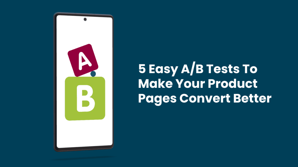
In this article, we’ll cover 5 actionable A/B tests you can start right now to help improve your eCommerce store’s product pages.

1. Test Your Call-To-Action (CTA) Colours
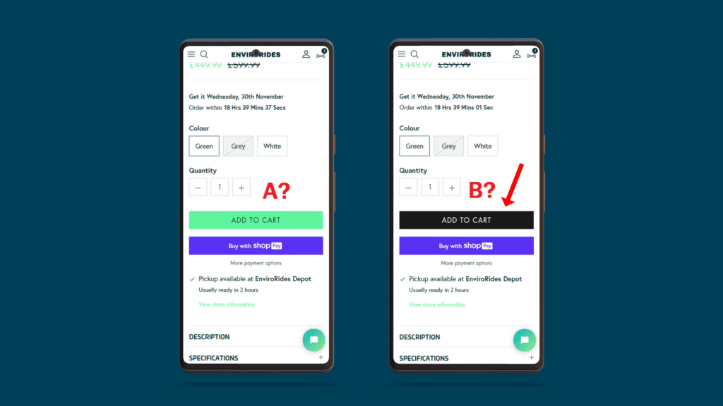
Test Your Call-To-Action (CTA) Colours

Your CTAs are one of the most important elements on your web pages. Without them, users won’t have a chance and successfully navigate through your website. However, this could also be the case even with CTAs. Your main aim is to make your CTAs one of the most prominent features on a webpage, they need to be easily recognisable and found wherever a user is on your website.

As CTAs are likely to be shapes or blocks, colour plays a big part in how they look. As a rule of thumb, you should always be using on-brand colours to help keep your website uniform throughout. When it comes to CTAs these should also contrast with the background they are placed on to help them stand out. 
Testing the colours of your CTAs is paramount to your store’s success! Staying on-brand, test 2 coloured CTAs against each other. As with most A/B tests, you may be surprised about what your customers prefer, in turn, increasing your conversion rates. Keep in mind the psychology of colour as this can be helpful before starting a test like this. You can get some inside knowledge about how humans interact with certain colours which will help you decide on what colours to test.

2. Test Your Call-To-Action (CTA) Text
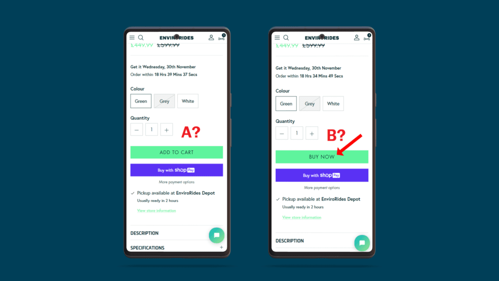
Test Your Call-To-Action (CTA) Text

It’s not just the colour of your CTAs you need to think about. It’s critical that they help instruct the user of exactly what will happen if the user was to click on them. This aids their journey and overall experience than navigating your website and has the potential to double your conversion rates! There are 2 main factors to think about before testing the text on your CTAs.

Text colour

The colour of the text on your CTAs must contrast with the colour of the CTA itself so that it is always legible. Light text on dark CTAs work tends to work well as these are easy to read on most sized screens from multiple angles and distances.

How it reads

This is the most important part of your CTA. What it reads will determine whether or not a user will click on it. As with most elements on a webpage, there are no right or wrong answers; it’s only what your user prefers. Your CTAs need to instruct the user instantly, depending on your intended outcome. On product pages, it’s easy to assume that ‘Buy Now’ is an easy win and that all your CTAs should be using it. But how about ‘Add to Cart’? Wouldn’t this give your users more control over their overall purchase decisions while also spending more time looking at more products, and therefore more likely to convert? Maybe, and that’s why it’s definitely worth testing.

3. Test Trust Signal Placements

Test Trust Signal Placements

Your potential customers may not be on your product pages for long, so having the ability to build trust with them in that short period is important as it is in any sales proposition. People tend to do what others have done before them and find comfort in knowing that others have had similar experiences. It’s good conversion rate optimisation practice to display reviews and testimonials on your eCommerce store. But where should you put them? 

Usually, placing this important information above the fold (before the user needs to scroll) on product pages could be the difference in someone buying your product or not. Test the placements, colours, shapes, numbers, etc. of reviews and you’ll eventually find what works best for your store.

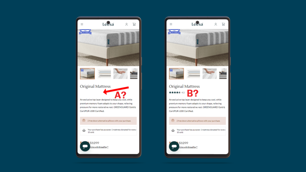
4. Test Engaging Product Headings

Test Engaging Product Headings

While all products have their obvious given names. It’s good practice to think about what you could add to your product headings that could make them more engaging. In this fast-paced informational world, it’s likely that potential customers don’t have the longest attention spans. so it’s in your best interests to grab their attention as fast as possible.

Think about adding benefits to your headings (within reason) and testing these new headings against their ‘undescriptive’ counterparts. Adding descriptive wording has the potential to draw more users’ attention and cloud result in higher clicks, lower bounce rates and overall increased conversions. There isn’t a limit to the number of A/B tests you could perform on your product headings, and doing so could improve your overall eCommerce store’s performance.

5. Test Your Product Images (Direction, Scale etc.)
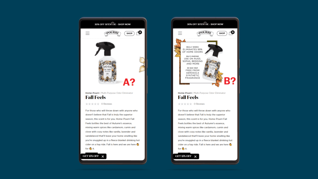
Test Your Product Images

Of any element on a product page, images are one of the most important. They are a window for potential customers to view your product for the first time. Additionally, they help the user understand how to use your product, and the scale of your product and ultimately lets them imagine using it in their everyday life. 

Images sell products, so your images need to be clear, and precise and give the user as much information as possible in as little time as possible. When it comes to A/B testing your images think about placement and what the user sees as soon as the page loads. Should you be showing an image of someone using your product before a specification image? Does the gender or age of the person in your image make a difference? It can be incredibly interesting to find out why someone decided to make a purchase, and your images will always play an important role in that purchase decision during their time on your eCommerce site.

Happy testing!

Recent Posts
Leave a Reply

Your email address will not be published. Required fields are marked *