A website is always the forefront of your online business as a place to welcome your target audience, show off your brand and push your products and services into the public eye. It is extremely important to the growth of your business and a must-have for any industry, but with approximately 380 new websites being created every minute, it is becoming a daily challenge to get yours noticed.
Getting your website noticed, though, is only half the challenge. When a user lands on your website, it’s then the real work begins. Applying conversion rate optimisation techniques gives you the chance to show them you are the best in your industry and prove to them you’re worth betting on. A user will decide this within a number of seconds, so you want to make the best first impression possible.
What is a landing page?
A destination page. A lead capture page. A static page. A landing page. These are all terms used to describe the first page of your website a user will see after clicking on a link. This makes them very important and so they should follow the right criteria to encourage the user to convert.
What the user sees first will determine whether they stay or leave. Here are five different ways to boost your landing page performance; from quality to quantity, we explain why they work and what you can add to yours to increase conversion rates.
Here’s what makes a great landing page that converts
1. Use strong imagery and video to drive conversions
As the old adage goes, a picture can tell a thousand words, and that’s part of what makes them so essential to landing pages. Images can persuade, entice and inspire, and a user’s eyes will always be drawn to them when a landing page is opened. It turns out there’s some strong science behind this; the brain processes images 60,000 times faster than text. It has also been proven that a staggering 80% of people remember what they see, while only 20% remember what they’ve read.
The stronger the image, the more likely it is that the visitor will stay, and studies have shown that faces perform best because it’s almost impossible for humans to ignore them. Faces can even influence user behaviour, and they promote trust and authority. It’s not all about faces, though. As long as your images are large, high quality and eye-catching, they will draw focus on your landing pages.
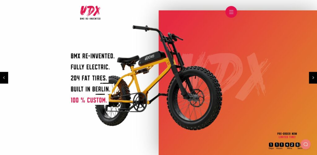
This example from UDX gives the user an experience from the outset with a striking image of the product front and centre that you see as soon as the page loads. In no time at all it conveys something that would take too long to read with the added bonus of letting the user know they are in the right place. There is still copy on the page, but the style is minimalistic and on brand – this is what allows you to reach those high conversion rates.
However, you shouldn’t limit yourself to imagery – video is even more powerful. People are wired to track motion, and adding video to your landing page can increase your conversions by as much as 86%. In addition to making complex products more accessible, they can entertain and allow users to get the information they need without wading through copy.
2. Present a focused call to action
Your call to action is the reason you’ve created your landing page, so you need to make it as easy as possible for users to convert. You need to know from the outset exactly what it is that you want from visitors, whether it’s that they make a purchase, make an enquiry, sign up for a newsletter or anything else. Present users with an obvious call to action (CTA) and direct them to that button to boost your conversion rate.
Keep your wording minimal – a simple ‘Get started today’ or ‘Learn more’ is perfect. You need to be direct and to the point. Having said that, try to steer clear of words like ‘submit’ and ‘enter’; you still need to be enticing with a sense of urgency.
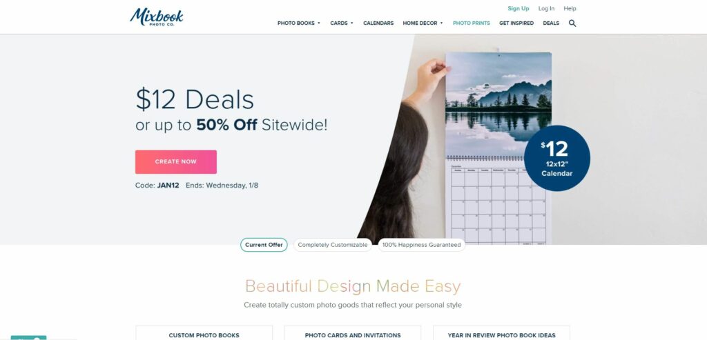
When it comes to button design, colour is more important than you might think. Green and orange are reported to perform best, but this will depend on your site design. Use contrasting colours to create striking buttons that the user can’t miss. You can also experiment with different shapes. Do rounded buttons work best for your site? Or do more people convert when the button has square edges? Take this example from Mixbook; it presents the user with a clear CTA button to ‘create now’ in contrasting colours with slightly rounded corners, and it’s visible as soon as the page loads. Impossible to miss, it entices the reader to click on it with its clear, engaging copy and on-brand design.
3. Use clear headings to stand out
The first pieces of copy users will see on your landing page are your headline and subheadline, so you need to make them count. The former should make them look and then the latter will make them stay. They need to be clear and easy to read as they explain what you’re offering. It’s an important chance to connect with your audience, so don’t let it go to waste.
As the visitor scrolls down the web page, make sure that the headings they see are bold and obvious; that’s how a user will know exactly what information is being offered and they will stay engaged. Keep your language simple and just remember that sometimes less really is more if you want users to convert from your landing page.
4. Outline the benefits
The internet is becoming more saturated with companies offering similar products and services – when potential customers come to your landing page, you need to make sure they know why you’re different. Shout the benefits of your product from the rooftops and watch your conversions increase as a result.
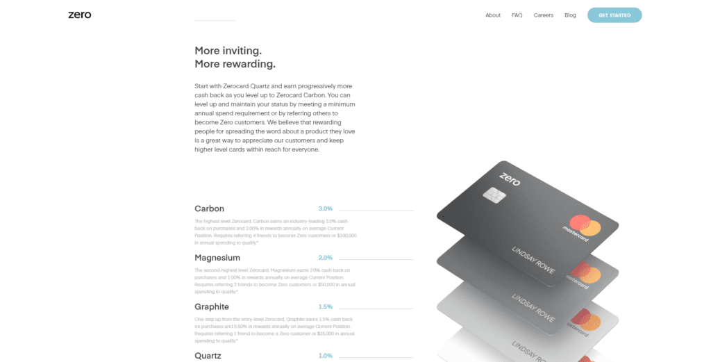
There isn’t just one way to do this. You can use subheadings, bullet-point lists and more. Take this example from Zero; the website is beautifully crafted for desktop and mobile with a simple scroll effect creating the illusion that all the information is on one page. It creates an intuitive experience with animated elements and short bursts of written information. The user has been told the full benefits of the business without realising it.
5. Include testimonials & social proof
There’s no denying that one of the best ways to show that your business is the one to use is by proving it’s been successful for others. But how can you do this on a landing page?
The answer is simple: showcase reviews and testimonials from satisfied customers. Positive comments from real people who have purchased and used your products or services are going to show potential customers that you can be trusted.
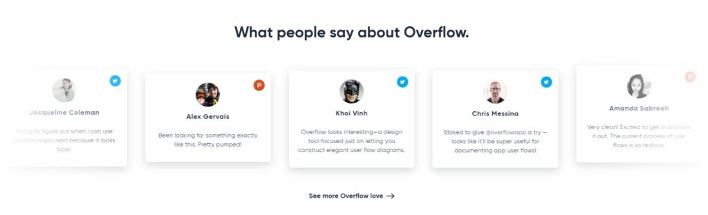
A great example of this comes from Overflow. On this particular landing page that’s optimised to convert, a carousel of reviews is featured that pulls reviews from around the internet. It’s a simple way to increase your conversion rate while doing very little.
Give it a go – see what works for you
The main reason to have a website for your business is to entice those new visitors to convert. Using any of these practices on your landing page will give you a fighting chance to keep those all-important users exploring it and become interested enough to be customers for your business.
It’s worth noting that the average conversion rate varies depending on what industry you are in – take a look at this report to see how well your niche compares.
Most of all, have fun with it. One way you can do this is by testing different versions of your page. You want your website to be memorable and stand out from the rest, so think of your landing page as a window to your business. It takes a total of 2.6 seconds for the user to find the feature on your page that most influences their first impression, so make it a good one and make a landing page that will convert.
Along with taking these recommended steps to increase conversion on your landing pages, the use of a UTM link generator can also give you insight into how well your pages are performing. A handy tool, track and monitor campaigns and landing pages to ensure enhanced user experience.
For further digital marketing advice, contact one of our specialists today.