
When potential customers land on your website, one of the first aspects of the webpage they will notice is your colour scheme. Even if it’s subconscious, your colour choice will affect how they view your content. In fact, brand recognition increases 80% when using colour.
So how do you decide which colours are best for your brand? We’ve put together a website colour guide for you to follow to help you decide.
The basic principles of colour
Colours are commonly grouped into three three systems or colour spaces:
- RYB
- CMYK
- RGB
These each have their own distinctive use of primary, secondary and tertiary colours.
RYB stands for red, yellow and blue, the primary colours that everyone learns at school. When mixed together, they form the secondary colours – green, orange and purple – which then make our tertiary ones.
CMYK – or cyan, magenta, yellow, black – is a subtractive system. Subtractive colour mixing is primarily used within print with the use of dyes and inks. These dyes or inks only allow certain wavelengths of light to reach the eye as they subtract partial wavelengths from the light source.
RGB, made up of red, green and blue, is well established within the digital realm as an additive system. It’s the main and most recommended method to use when building websites. RGB works under the concept that the more colours you add of a certain value, the brighter it becomes. Because computer monitors emit light, graphics cards usually support RGB values.
Colour combinations
If there’s one thing you should take away from this website colour guide, it’s that there’s much more to choosing colours for your website than just going for the ones you like. The most successful companies like Coca-Cola, Apple and Dell have all chosen theirs for specific reasons. Science backs up their choices – but more on that later.
When it comes to general design principles and mastering colour, patterns emerge. Here are the most popular combinations that get used on websites.
However, this is just a general guideline and you will need to learn more about web design and colour theory, in particular, if you’d like to dive deeply into the topic.
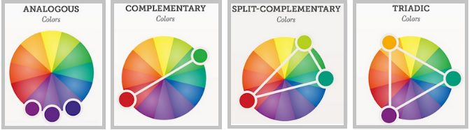
Analogous
If you’re after a comfortable and seamless design, analogous is the one for you. It comprises three colours, all located next to each other on the colour wheel, and encourages smooth transition.
The key to success here is finding neighbouring colours that look seamless but can still contrast each other. This way, you can make the key elements of the web page appear more prominent while still having a smooth design.
Complementary
We all know that opposites attract, and this is the basis of complementary colour schemes. Once you have selected a colour, then its opposing value on the colour wheel becomes your secondary colour. For example, if you choose blue then your second colour will be orange.


While this combination can provide a ton of contrast, it’s easy to cross that fine line into being blinding. Elements can become lost on your page, making it counterproductive to the user’s experience.
Triadic
If you’re after contrast and vibrancy, you want the triadic colour combination. To do this, choose your primary colour and then find out which ones are roughly 120 degrees from it on the colour wheel. This will form a triangle.
Balance is key here. Your primary choice will take the sole focus, so choose wisely. Meanwhile, your secondary colours will act as accents, emphasising aspects of the page.
Split-complementary
The last combination we’ll cover in this website colour guide is split-complementary. A variant of the complementary combination, this alternative creates a triangle on the colour wheel. After choosing your primary colour, find its opposite on the wheel and then go to the two either side. These will be your secondary colours.
Split-complementary is often used by beginners in web design because it’s easy to work with. It also boasts the perk of providing contrast on your website while decreasing your chances of blinding your users.
Colour theory
In most cases, companies base their colour schemes around their logo. But while this maintains brand consistency across multiple platforms, it’s not always the best option. Do what works for your website.
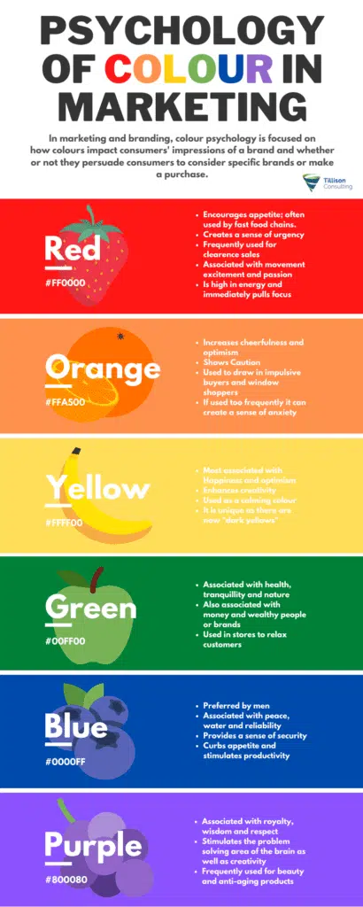
There are many factors for you to consider when it comes to colour combinations. Every colour elicits an emotional response. You need to think about how you want users to feel when browsing your website.
Take Tillison Consulting’s colours, for example. Blue is associated with productivity and reliability, while green makes people think of relaxation and security.
Orange is used to create a sense of cheerfulness and optimism, and it’s often used to draw in impulsive buyers and window shoppers. Meanwhile yellow instills energy and action.
It’s also important to take any cultural consequences of using particular colours into account. For instance, while red triggers energy, excitement and affection in the Western world, in China it’s associated with prosperity.
Colour and hierarchy
So you’ve chosen your colours – how do you use them?
When designing your website, it’s important to remember that it’s your responsibility to guide the user. If you want them to look at particular places on a page, you need to establish a visual hierarchy. A great way to do this is by manipulating colour to highlight focal points.
Your primary colour will usually be used for headings and calls to action. Basically, put it where you want your users to navigate to first.
Let’s take a look at this in practice.
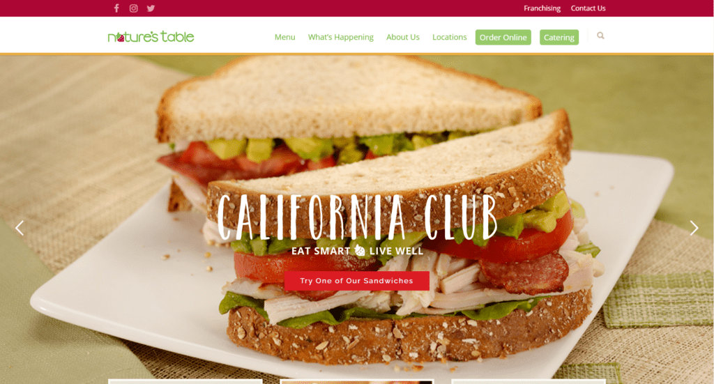
Take a moment to look at the screenshot above. Using what you’ve already learnt in this website colour guide, what do you think the primary colour is?
It’s that bright red that’s used on the header and the call to action in the middle of the image. It’s also used in the banner that houses their landing page’s conversion points of ‘order online’ and ‘contact us’.
So how do you use your secondary colours? If you have content that you want to stand out but not be the main focal point, that’s where your accents come in. This could include:
- Secondary call-to-action buttons
- Subheadings
- Information boxes
How to choose the right background colour for your website
You’ve got your colours sorted and you know how to use them. But what colour should your website’s background be?
The simple answer is: it depends. It depends on what kind of website you’re designing and what its main focus is.
News and eCommerce sites work best with neutral backgrounds. This is because you’re trying to inform or sell an idea or product, so you want that to take centre stage. Your content needs to be as visible and readable as possible.
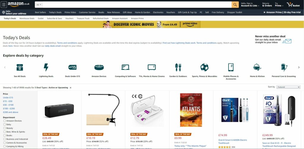
Source: amazon.co.uk
But that’s not to say that you shouldn’t use any colour at all – the last thing you want is to make it look dreary. Make good use of your primary colour to draw attention to the focal points on your site.
Most businesses sell products or services, but what about when your company is more brand-focused? You’ll need to take a slightly different approach to your background colours.
In this instance, use your primary colour (or another colour from your palette) for your background. This helps users build a link between the colour and your brand.
These associations aren’t uncommon – when you think of the colour orange, which brand comes to mind? It’s probably budget airline EasyJet, which uses a bright, primary orange. What about green? Your first thought could be Starbucks or Spotify.
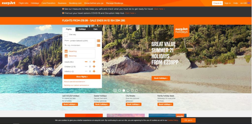
Source: easyjet.com
Then there are those with graphic-heavy or portfolio websites. If you fit into this category, the world is your oyster. You have the freedom to choose the colours you want – so long as users can still read and navigate your site.
Useful tools
Coolors
If you want to explore trending colour palettes or make your own, Coolors is a great website that does just that. You can even generate a random colour palette using their handy tool – once you lock a colour in, it then generates matching ones so you can create a seamless design.
The fun doesn’t stop there – adjust saturation, create palettes from photos and find out how users with different colour blindness will be able to see your palette.
Adobe Color
Use Adobe’s colour wheel to choose your colour palette by selecting your colour harmony rule (analogous, triadic and so forth). You can then drag the points on the wheel to create the perfect colour scheme for your website.
Adobe Colour also provides a colour blind simulator, but not in as much detail as Coolors.
CheckMyColours
If you’re looking to see if your current foreground and background colours have sufficient contrast when viewed by someone having colour deficits, use CheckMyColours. All you have to do is insert your URL to see what errors are thrown up.
Key takeaways
The most important thing to remember when choosing your colour palette is that it’s not for you. Every part of your website needs to be geared towards your customers. You want to create a subconscious emotional bond with your audience, and colour is a great way to do that.
Use colour to spice things up – that’s the whole point of design! Just make sure your design and colour don’t overpower and drown out your incredible content.