
Before you run around screaming in blind panic that your Google rankings are about to fall off a cliff, they’re not. Well, some are. Google’s 21st April mobile friendly update announcement is simply the confirmation of a long-expected change that will affect ONLY your rankings for mobile search, not those for desktop search.
This is still a big problem for your marketing strategy, given the scale of mobile search traffic and the multi-device behaviour your customers will be adopting.
In February 2015, Google announced a change to Mobile Search results:
“Starting April 21, we will be expanding our use of mobile-friendliness as a ranking signal. This change will affect mobile searches in all languages worldwide and will have a significant impact in our search results. Consequently, users will find it easier to get relevant, high quality search results that are optimized for their devices.” (Feb announcement).
In this post are the following resources to help you make your website mobile friendly.
- The Internet Is No More
- The Pain of Ignoring Mobile
- Analysing Your Own Mobile User Volume
- Mobile Readiness Tools and Resources
- Mobile Options for Different Platforms
- More Mobile Marketing Resources
That Internet Is No More
The Internet as we knew it just a short time ago has changed significantly. No longer are we spoiled (we didn’t know it at the time) with the vast majority of users using the Internet with common screen dimensions, using a keyboard and a 4:3 screen size or even some getting all fancy and jumping to widescreen displays.
In that heady, pre-app and pre-mobile device world where there were few browser choices, life was relatively simple. Today’s Internet use is diverse with multiple browsers using a multitude of different devices, operating systems, screen dimensions and screen resolutions and yes, even limitations on bandwidth.
If your mission is to gain as many leads and sales through your website from as many users and traffic sources as possible, your website needs to suit every user possible, whether they’re using a mobile device, a tablet, a desktop, their Sky TV box or their Playstation or XBox, whether they’re bandwidth poor or enjoying a superfast connection.
Google’s update reflects the unprecedented growth in mobile device use with mobile search outstripping desktop search and users demanding the Internet be conveniently placed in their pocket when they need it, not when they’re near a desktop or laptop computer.
Google’s own research revealed that 90% of multiple device owners switch between screens to complete tasks online.
These are the Facts:
- Google’s has to address the needs of its user base to maintain its dominant position in search.
- Google’s job is to provide the most relevant search results for the user.
- Users on mobile devices get a better experience on mobile-ready websites, spend longer there and are more likely to buy.
Google’s algorithm change makes the end-to-end mobile experience a better one for the user. If your site isn’t mobile-ready, get ready to see a drop in organic mobile traffic on or shortly after Google’s 21st April mobile friendly update.
The Pain of Ignoring Mobile
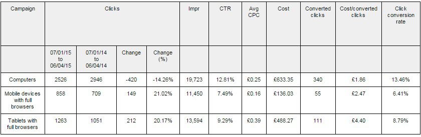
The data perfectly illustrates the growth of mobile and the need for a mobile marketing strategy which we posted about back in 2013.This table shows data from a 90 day period from Jan-Apr 2015 compared with the same period in 2014. This eCommerce site has not been optimised for mobile – the User Experience is better than some, but is not a responsive design.
-
- Mobile clicks increased by over 130%
- The mobile conversion rate is significantly lower than on desktop (6.4% compared to 13.5% – nearly 50% worse)
- The cost per conversion (CPA) is therefore higher too
- Clicks from desktop devices have reduced in that same period by 14%
- Clicks from tablet devices have increased by 21%
Analysing Your Own Mobile User Volume
This T-Time hangout explains how to use Filters and Segments to analyse mobile visits to your website, through which you can analyse visitor numbers and trends, bounce rate, pages viewed, exit rate and many other useful statistics and you’ll be able to compare those against visitors using desktop devices to see how they compare too.
For eCommerce stores, assuming that you have eCommerce tracking configured, you’ll also be able to assess how many sales and their value are attributed to mobile traffic too.
Mobile Readiness Tools and Resources
Google Chrome Extensions to Test Mobile Readiness
Use the Glimpse Chrome Extension to take a quick glimpse at the mobile view of any Web page from within Chrome on a desktop.
With the User-Agent Switcher for Chrome, you can quickly and easily switch between user-agent strings, fooling websites into thinking that you’re on a number of different devices, presenting a view of how your web page might look.
The Mobile/Responsive Web Design Tester allows web designers to test their web pages against common mobile, phablet and tablet devices by emulating the user agent and screen resolution.
If you’re a Chrome user, right-clicking (CTRL + SHIFT+ I also works) on any web page should provide an option to “Inspect Element” which opens up a Pandora’s box of fun and insight. Within this tool, there’s also an option to Toggle Device Mode, which should also give some insight into how the web page looks on a mobile device.
Web Testing Resources for Mobile
If you want to test a few pages, try Google’s own Mobile-Friendly Test. This will analyse a URL and report if the page has a mobile-friendly design.
Within Webmaster Tools, there is also a Mobile Usability Report (we use this in our own Analysis of User Experience).
Google also provides some useful tips and advice with its own guide to user friendly mobile sites.
FirstSiteGuide provides a neat tool that discovers important information about any website – the tool analyses technologies the website uses and how well it performs.
The W3C Mobile Checker performs various tests on a Web Page to determine its level of mobile-friendliness.
ready.mobi provides a rather neat, quick test of any mobile page you’d care to enter, presenting a view of the page on multiple devices
There are a heap of resources to help your website work across multiple devices over at Think Google for Mobile Web Principles to Responsive Web Design.
Mobile Options for Different Platforms
In the quest for mobile-friendliness, there are a ton of different options depending on the platform your website is built on (the CMS). This section gives pointers for a few of the most popular Content Management Systems.
WordPress Websites Mobile Friendliness
Free mobile-ready Responsive WordPress Themes available via WordPress.org.
Mobile-Ready Responsive WordPress Themes via wpmudev.
Mobile-Ready Responsive WordPress Themes via ThemeForest.net
Mobile-Ready Responsive WordPress Themes via Template Monster
WordPress Mobile-Friendly eCommerce
A collection of the best mobile-ready responsive eCommerce WordPress themes for online shop and store websites via PremiumWP.
30 beautiful and mobile-ready responsive WordPress e-Commerce themes via Hongkiat.
25 Free & Mobile Ready Responsive eCommerce WordPress Themes Powered by WooCommerce via colorlib.com
Magento Mobile-Friendly eCommerce
379 Mobile-Ready Responsive Magento Themes via Template Monster.
137 Mobile-Ready Responsive Magento Themes via ThemeForest.
Shopify Mobile-Friendly eCommerce
Mobile-Ready Responsive Shopify Themes on Shopify.
63 Mobile-Ready Responsive Shopify Themes via ThemeForest.
7 Awesome Mobile-Ready Responsive Shopify Themes via Demac Media.
Mobile-Friendly Joomla Websites
32 Mobile-Ready Responsive Joomla Themes via JoomlArt.
Top 10 Free Mobile-Ready Responsive Joomla Themes via Hongkiat.
Mobile-Ready Responsive Joomla Templates via JoomlaBamboo.
32 Mobile-Ready Responsive Joomla Templates via Themexpert.
Speak with a SpecialistGet a Free SEO Audit
